Normative Typography: Poster Design
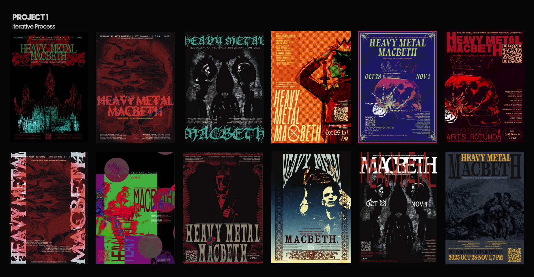
This project consists of designing the promotional poster for the theater play Heavy Metal Macbeth, a production organized by the Performing Arts Program of the College of Arts and Sciences at AUS. Just as its name indicates, this is a reinterpretation of Macbeth through an ‘80s lens, with aesthetics and energy inspired in heavy metal music. The poster visually transmit the essence and theme of this play, and also effectively communicate all practical information about the event. Using the fundamental principles of typography, exploring the relationships between image, color, and text.
Typography
〰️
Typography 〰️
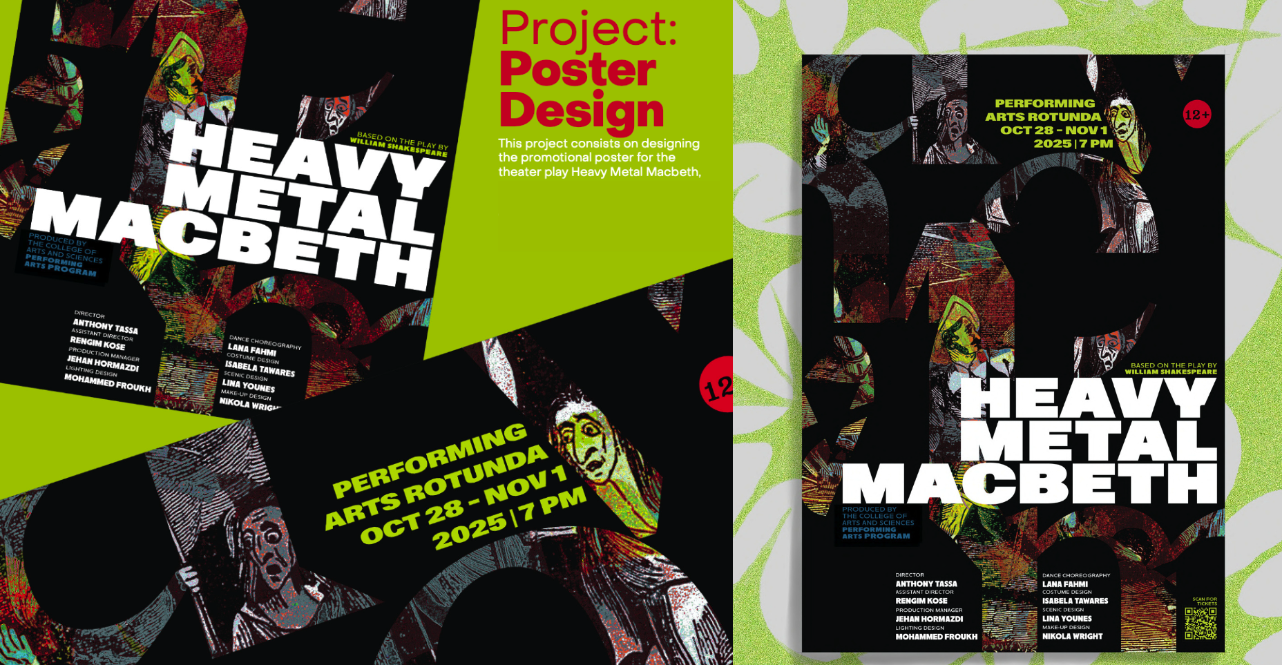
This poster represents both Heavy Metal and Macbeth, combining medieval aesthetics in the visual graphics with 1980s aesthetics through the bright accent colors of yellowish green, red, and blue. These design choices emphasize and differentiate the elements within the poster while also maintaining a clear hierarchy for viewer legibility.
This was also achieved through the choice of typeface, although I was torn between the bold sans serif type and the serif type that aligns with Macbeth. I decided to go for the heavy high-contrast type to not only catch the viewers' eye from a distance but also to ensure that the viewers' attention is kept in the foreground so that the display type does not get lost within the poster.
One of the main things I was proud of in my poster is the visual graphic I used. This graphic was originally a wood engraving. It conveys the concept of the poster as it is one of the scenes from Macbeth. I had a different design layout with the graphic as the background, but the use of letters allows me to intentionally create spaces within the poster to show snippets of the scene from Macbeth. This allows me to focus on typography as well as have visual flow.
The main idea behind using the letters as a frame to hold the graphic is that it creates a sense of visual ambiguity that sparks intrigue within the viewer, causing them to stay longer to look at my poster, which is exactly what I want. I edited the graphic in a collage form so that certain parts of the image show through the letter frame. I intentionally positioned the image to highlight the three witches and Macbeth, so the closer the viewer gets to the poster, the more details they can notice and enjoy.
Aligning the “Based on...” and “Produced by...” with the display text creates a sense of balance, as the different type sizes contrast each other really well. Compared to the previous layout, where the blue text was aligned next to the credits, this alignment allows for breathing space/negative space. I also made use of the negative space made by the letter form “m” to place the credits and the QR code, almost turning the space into a 4-column grid-like structure.